An ambiguous colour for a long time, both linguistically and chromatically, orange has a complex history. It was little appreciated, until its use was sanctioned first by Newton and then by Impressionist painters. Today, its best-known applications are related to its visibility characteristics – but, as always in the study of colours, it also has some surprising facets.
“Orange is red brought nearer to humanity by yellow” - Wassily Kandinsky
The result of the combination of red
and yellow, orange is a captivating colour, capable of polarising attention and ever-present in many moments of our daily lives, also considering it is the only colour whose name derives from a fruit we have before our eyes every day: the orange, of course. In the many languages spoken in Europe, before the introduction of this fruit in the 15th century by Portuguese sailors who imported it from Asia, there was no precise term or definition for this colour. According to some sources, that is why we usually use phrases such as “red fish” and “red hair” to indicate things that are actually not red. It thus remained undefined not only linguistically but also chromatically, since the mixture of red and yellow is technically difficult to reproduce in dyeing and painting. For a long time, it was also associated with the negative aspects of the two colours that make it up, only regaining appreciation when it began to be linked to gold.
In nature, orange is the colour of autumn, of bright sunsets, of fire, of fruits such as oranges, apricots, and persimmons, and of flowers such as lilies and tulips. It evokes freshness, cheerfulness, excitement, strength, cooperation, honour, generosity, adventure, warmth, good health, joy, spontaneity, positivity, energy, and vitality. It is thought to be one of the colours that children most love. However, it also has some negative associations with superficiality, arrogance, cockiness, pride, and impatience. Because of its high visibility, finally, it is the colour of traffic cones, work bibs, American prison uniforms, and life rafts, but also of Halloween with its pumpkins, of some iconic architecture of our time, and of rust.
The origin of the word “orange”
As mentioned, the term “orange” (in Italian arancione, in French and German orange, in Spanish and Portuguese naranja) has been in use since the 1500s to refer to the colour of the orange fruit, the name of which has, however, a much more complex etymological origin. The first documented use of the word dates back to 1502, when it was chosen to describe some of the fabrics kept aside for the wedding of Princess Margaret Tudor to King James IV of Scotland. It derives from the Sanskrit word naranga, which was used to refer to the orange tree and which, in turn, was possibly related to the saffron-yellow hue of the pistils of a plant called nāgakesara (its current scientific name is mesua ferrea). This was later used in the Persian language as narang
and in the Arabic language as naranj (from which the Venetian dialect term naranza or narancia is also derived). In Low Latin (arangia
or aurantia) and later in several European languages, the loss of the initial “n” was perhaps due to the influence of the Latin word aurum, i.e. “gold”, with which orange began to be associated from the 16th century onwards.
Orange in ancient history
Despite not having a name, orange was present in ancient history since prehistoric times. The oldest cave painting ever found in the world is that of a banteng bull dating back 40,000 years in the cave of Lubang Jeriji Saléh, on the island of Borneo (Indonesia), where red-orange ochre pigments or iron oxide were used to paint the walls and ceiling with hundreds of handprints (probably dating back 52,000 years), animal depictions, and anthropomorphic figures. In early civilisations, such as in Ancient Egypt, orange was obtained from a mineral called realgar, considered by many to be the only pure orange pigment in existence until the 19th century. In Ancient Rome, it was joined by another mineral, orpiment, which was at least as dangerous and toxic as the former. Both were widely used until the Middle Ages for miniated manuscripts – in particular, Christians used orange as a symbol for sins of gluttony. Its natural golden yellow hue made orpiment of great interest to alchemists, too, who speculated that it contained the secret to creating gold. In Ancient India and China, where orpiment was employed as a medicine despite its high arsenic content, a semi-precious stone called carnelian, which was undoubtedly safer and less toxic, was used instead to obtain orange tints.
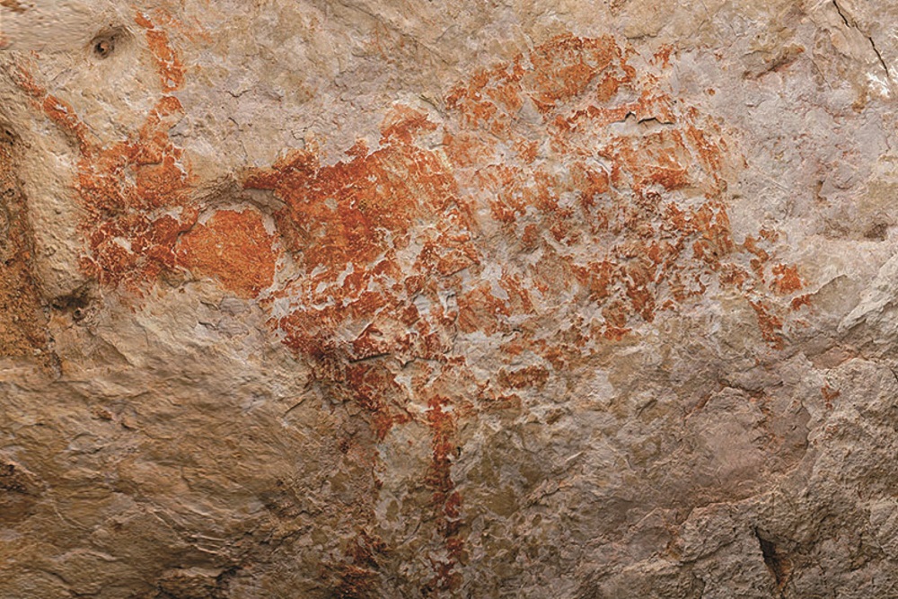 The banteng bull found in the Lubang Jeriji Saléh cave on the island of Borneo (Indonesia) and dated back 40,000 years. © Luc-Henri Fage
The fortune and misfortune of orange between the Middle Ages and the Renaissance
In the Middle Ages, orange remained a difficult mixture to obtain and a tint that did not meet the criteria for quality colours at the time, namely saturation and stability. That changed when it began to be obtained from saffron, a rare, expensive, and delicate product reserved for precious fabrics such as silk. Above all, it was the increased knowledge of the properties of the fruit of the same name that redeemed it and led it to be increasingly associated with golden yellow, exoticism, and later with power and wealth in both Eastern and Western societies. During the Renaissance, however, it underwent another decline: orange lost importance – there are few paintings of the time in which it is present – and ended up being used in fabrics intended for the clothes of peasants or the middle class who wanted to imitate the red-embellished clothes of the nobility.
The redemption of orange
Finally, in 1670, Isaac Newton officially codified orange in the spectrum. In 1765, a rare, bright orange-red crystalline mineral called crocoite was discovered in the Beresof mine near Yekaterinburg in the Siberian Urals (Russia): that led to the creation of the synthetic orange chromium pigment in 1809, soon to be followed by other synthetic pigments, such as cobalt orange. Between the 17th and 18th centuries, paintings began to become more widespread that used this colour in association with positive concepts. For instance, Pomona, the fertile goddess of abundance whose name derived from the Latin word pomon,
meaning “fruit”, was often depicted wearing an orange dress or cloak. In England, it became very popular among the Pre-Raphaelites: the flowing orange-red hair of Elizabeth Siddal, the wife of the painter Dante Gabriel Rossetti, became a symbol of this movement. Albert Joseph Moore, active in the second half of the 19th century, also painted festive scenes of Romans wearing bright orange cloaks – brighter than any Roman would ever actually wear.
Orange in contemporary art
Starting in the 19th century, the new synthetic pigments mentioned and the invention of the metal paint tube in 1841 enabled artists to paint outdoors and capture the colours of natural light. The first painter to inaugurate the technique later known as en plein air was the Englishman William Turner, remembered today as ”the painter of light”, who was joined by the Italian Macchiaioli movement and the French Barbizon school – from which the Impressionist current took off, of which Pierre-Auguste Renoir and Claude Monet were exponents. The latter painted “Impression, Sunrise” in 1872 – hence the movement’s name, Impressionism – whose focal point is a tiny orange sun, with its reflection illuminating the water surface. Orange thus became a crucial colour for all Impressionist painters: they had studied colour theory and knew that orange placed next to blue made both colours appear much brighter. To cite just one example, Renoir painted boats with orange brushstrokes applied directly from the paint tube. The importance of this tint was also evident in the following period: to fill his works with light and exoticism, the Post-Impressionist artist Paul Gauguin made extensive use of it as a background colour and for the clothes and skin tones of the Tahitian women featured in his famous paintings.
Van Gogh’s orange
The painter we most associate with orange and yellow is undoubtedly Vincent Van Gogh. This artist depicted many touching and enthralling landscapes with the skilful use of these colours, which recall the pure sunlight of Provence or, by contrast, the moon and stars in a cobalt-blue sky. It was probably this that later inspired the use of orange in more introspective paintings, where it was applied to achieve a positive contrast to dramatic subjects: just think of Edvard Munch’s “The Scream” (1893-1910), Egon Schiele’s “Self-Portrait in Orange Jacket” (1913), and Francis Bacon’s “Three Studies for Figures at the Base of a Crucifixion” (1944). At the same time, orange was also the protagonist of more light-hearted works such as Paul Klee’s “Senecio” (1922), in which a face composed of a series of overlapping circles and squares is depicted using the typical cubist technique and whose predominant colours are orange, yellow, and blue. A fun fact to close this artistic roundup: one of the most expensive works of contemporary art in the world is the painting “Orange, Red, Yellow”, created by the American artist Mark Rothko in 1961 and sold at the Christie’s auction house
in New York for USD 86.9 million in 2012 – it is an actual dive into a canvas densely coloured with the three tints mentioned in its title.
Orange in the present day
Some cultures consider orange sacred because it represents a link between red’s strength and yellow’s perfection. In Hinduism, orange is worn by the god Krishna. The typical orange robe of Buddhists, the kesa, represents enlightenment and the renunciation of earthly pleasures, an opposite meaning to that attributed to this colour by early Christians, as mentioned before. As the official colour of the Netherlands, worn by its representatives at various sporting events and their fans, orange recalls the origins of the royal family from the principality of Orange-Nassau; it was also present in the country’s national flag until 1937, when a royal decree established that red would replace orange near white and blue.
In the Western world, it has been used on several occasions to support specific political factions: it became the symbol of Viktor Yushchenko’s nonviolent revolution in Ukraine in the aftermath of the presidential elections on 21 November 2004 and of the Protestant party in Northern Ireland, recalling the Protestant group that supported William of Orange in the War of the Two Kings, which culminated in the defeat of the Catholic monarch James II; it was included in the official flag of the Irish Free State alongside green, which represents the Catholic community, at least according to some sources, and white, which represents the element of reconciliation between the two factions.
Orange in nature: from hippo sweat to Alaskan river rust
This colour is also much present in the animal world, perhaps more than we might believe. It is the chromatic characteristic of some birds’ beaks (toucan, cardinal, and oystercatcher) and plumage (Guianan cock-of-the-rock), but did you know that it is also found in the sweat of hippos? Yes, because their “sweat” – technically not sweat at all – is composed of red and orange pigments, with the former containing an antibiotic and the latter absorbing UV rays: together, they protect these mammals’ epidermis against bacterial infections and sun damage, creating a natural sunscreen. Also, did you know that dogs, cats, but also deer cannot distinguish the colour orange? Some researchers at the University of Georgia have carried out in-depth studies to reach this conclusion, which is helpful for both scientists and anyone wishing to approach a deer (with good or bad intentions) without being noted.
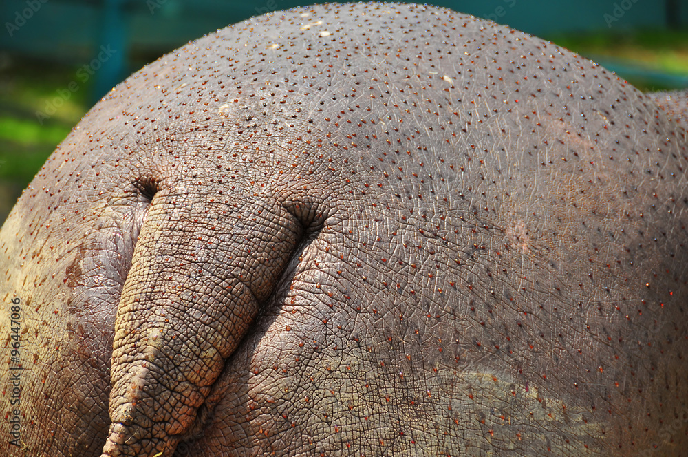 Hippopotamus “sweat” consists of red and orange pigments. © AdobeStock
In natural elements, this colour is more challenging to identify. However, a few months ago, news reported by CNN revealed a surprising phenomenon by which some Alaskan rivers are turning from clear blue to orange. According to scholars, this colour change, which is actually common in some geographical areas such as the Appalachians due to the presence of mining settlements but exceptional in wild, uncontaminated areas far from mines, could be due to the toxic metals released by thawing permafrost. We in the surface treatment sector could argue that, for once, the harmful phenomenon of rust is not due to the lack of prevention and maintenance that typically causes corrosion
of metal structures... although it is little consolation in this case.
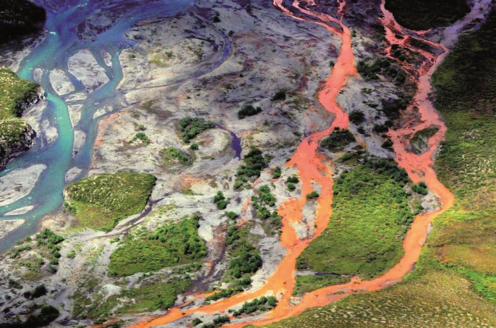 An aerial view of the Kutuk River turned orange in the Gates of the Arctic National Park (Alaska, USA). © Ken Hill-National Park Service
Fun facts about orange
This colour’s high visibility and contrast characteristics led it to be chosen for the uniforms of American prisoners and the suits of astronauts during spacecraft take-off and re-entry. In the former case, this tint makes prisoners more identifiable in the event of an escape; in the latter case, it is useful in the event of accidents during take-off or re-entry, when astronauts may be forced to abandon their damaged vehicles, often ending up in the middle of the sea: thanks to their “international orange” suits, they would be more easily spotted for rescue.
International orange is indeed a colour used all over the globe to mark obstacles, contrasting them with the surrounding landscape or structures and the background of the sky. It is also used in architecture with the same function. For example, it was chosen for the Golden Gate Bridge in San Francisco (USA) so that the ships reaching the bay can distinguish it from its surroundings and amidst the typical coastal fog. The origin of the adjective “golden” attributed to this bridge is, in fact, linked to its location above the Golden Gate Strait, connecting the Pacific Ocean to the San Francisco Bay. Did you know that the Eiffel Tower was also painted yellow-orange
in 1899? Before the “brun Tour Eiffel” was definitely chosen in 1968, the Parisian tower wore several “dresses” in different colours, changing hues from yellow to ochre to orange.
 When it came to choosing the colour of the Golden Gate Bridge, the architect in charge of the work, Irving Morrow, chose international orange to make the bridge visible to incoming ships even when Karl The Fog – that is what residents call the mist that characterises this stretch of coastline – makes it impossible to distinguish anything in the bay.
In fashion, someone who liked to wear orange – quite unexpectedly, considering her role – was the late Queen Elizabeth II: she probably chose it to stand out better and make it easier for security personnel to monitor her movements. Finally, in marketing, many famous companies have selected this tint for their logos. To name a few: Amazon for its “smile”, Italy’s Wind, the Netherlands’ TNT (perhaps for patriotic reasons), Denmark’s Just Eat (associated with reassurance and friendliness), and USA’s Harley Davidson and Nickelodeon (to express an idea of adventure and fun).
At the end of this lengthy excursus on the history of orange, we can conclude that Kandinsky undoubtedly nailed the essence of this colour, which remained ambiguous for such a long time: orange is how the joyful, lighter yellow makes the impetuousness and violence of red more acceptable to human eyes.