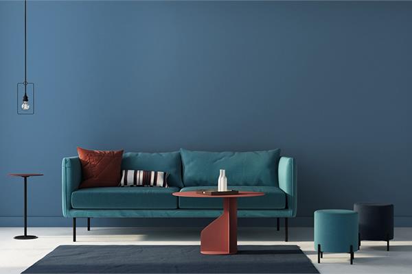
Blend of cobalt, moody ink blue offers escapism in today's data-driven society
In a world where sleep is viewed as a luxury and the anxiety of a fast-paced life is all too real, it is only fitting that PPG paint brand's 2020 Color of the Year, Chinese Porcelain (PPG1160-6), offers escapism in today's technologically driven society. Hand-selected by PPG's global colour experts, the shade is a blend of cobalt and moody ink blue that imparts calmness and restful sleep while also offering the spirit of hopefulness - a precious commodity in a restless world.
"The faster technology moves and the more convenience it offers, the more we seek activities, experiences and lifestyles that impart slowness and realness into our lives," said Dee Schlotter, senior colour manager, PPG paint brand. "The need for simplicity and escapism from technology is, in part, the reason that consumers are craving blues like Chinese Porcelain that bring us closer to natural elements such as the sea and sky - creating serenity in any space."
The increasing need for connection in an unmoored world was a reoccurring theme at the recent PPG Global Color Workshop. This annual event brings together more than 20 PPG global colour stylists from the automotive, consumer electronics, aerospace and home paint and stain industries. Over the course of several days, the stylists analyse the runway, lifestyles, demographics, geographies, and global and cross-cultural societal inspirations to determine what colours will resonate and represent the PPG global colour forecast, including the PPG Color of the Year.
"As we look to 2020, we know that colour is the trend," said Schlotter. "Consumers are tiring of stark greys and are looking to infuse colours that delight the senses. Blue is the easiest possible entry point from the world of neutrals to the world of colour, and PPG's Chinese Porcelain delivers the energy and brightness of cobalt blue - a trending hue taking the automotive, consumer electronics and fashion industry by storm. It also incorporates a deep, muted navy tone that is popular in residential and hospitality design."
According to recent data released by Paintzen, a PPG-owned technology platform that allows customers to pick colours and schedule painting services, blue is the most explored colour family by its users, with 34 percent higher engagement than neutrals - the next most popular colour family on the site. Of the blue hues, Chinese Porcelain was the most engaged colour on the platform over the past six months.
Chinese Porcelain is a rich and traditional hue that provides the perfect, agreeable backdrop for vivacious colours to pop. It also can act as a feature colour in a bedroom with crisp white bedding and crown moulding to provide a sharp contrast. In the living room space, the hue can be layered with additional blues in tufted and velvet furniture or paired with trending metallic finishes like Hushed Copper (MTL141) from the PPG METALLIC TONES collection.
Schlotter recommends pairing Chinese Porcelain with décor such as lush drapes or velvet pillows in warm saffron and turmeric tones. The hue also pairs well with leather accents and dusty sand tones for an attention-grabbing look.
While Chinese Porcelain is recognized as the PPG 2020 Color of the Year, it is also the focal point for the broader PPG 2020 Global Color Trends Forecast. This forecast provides direction and inspiration to architects, designers and homeowners across the hotel, retail and residential markets. PPG's customers in all business sectors rely on the forecast for new products and colour specifications in the architectural, aerospace, automotive and consumer electronic industries.
The colours are brought to life through the following three trend stories, each nestled within the overarching theme of Flow.
On the Move: This upbeat and playful colour palette addresses consumers who are looking to remake, reuse and merge cultural influences from different eras, creating a fresh aesthetic that feels simultaneously retro and contemporary. Mismatched hues like PPG paint brand's Brilliant Blue, Turner's Yellow and Bleeding Heart deliver joyful colour combinations that encourage self-expression from the bold and confident consumer.
At the Core: Taking cues from Mother Nature, this colour collection is earthy, botanical and sustainable, resonating with consumers who are looking for a state of balance between long-lasting and purposeful living. These colors evoke comfort and nostalgia, particularly the muted mid-tones. Bright hues such as PPG paint brand's Crushed Pineapple and Carrot Cake feel rich when contrasted with Comfort, Life Lesson, Cool Concrete and Kangaroo Paw, which double as tinted neutrals.
In the Know: With an emphasis on knowledge, reflection and innovation, this theme represents consumers who are eager to change society while contributing to a future that is better than the past. The palette acknowledges the convergence of technology and earthliness by featuring raw, natural hues like PPG paint brand's Cinnamon Spice and Brown Clay, as well as organic, oxidized blue-greens like Celestial Blue and Summer Breeze.